VS2010 Tips #9: Moving from Multiple Documents window layout to Floating Window of Visual Studio 2010

If you’re one of the fans of Multiple Document window layout in previous versions of Visual Studio, you will miss that feature in Visual Studio 2010.

Below is the options of Visual Studio 2008
image

And this is the option of Visual Studio 2010
image

Yep the setting of Multiple document is no longer there.

That would not be a big issue. Visual Studio 2010 has new feature Floating Window. You can make the editor window to float by simply right clicking the tab title and choose Float.

image

The editor window is now floating. You can drag anywhere.

image

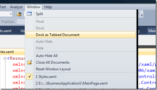
To dock it back, you can do from Window -> Dock as Tabbed Document
image

This feature is better isn’t it? You can even drag it to the external display 🙂


Posted

in

by

Comments

26 responses to “VS2010 Tips #9: Moving from Multiple Documents window layout to Floating Window of Visual Studio 2010”

  1. Mika Avatar
    Mika

    no, it’s not. the tabs are annoying, visually horrible, and take a chunk of my small monitor. bring back the multiple documents

  2. Hovig Avatar
    Hovig

    This may be convenient to some, but horrible for someone who prefers to use hot keys.

    Alt + w + v would tile my windows vertically
    Alt + w + z would be horizontal.

    I can see how tabbed and docked windows works for people with large or multiple monitors. But for a laptop programmer like myself I despise this new layout also for the fact that there is no way to auto load windows docked or a hotkey to auto align them. I don’t use the mouse or touchpad period.

    I love vs for the functionality of multiple docs. I am glad I only downloaded express 2010. I will not purchase until multiple docs are back.

  3. Erik Avatar
    Erik

    This is terrible. I don’t want to see the tabs, and I don’t want them to take up my screen. This is about as intelligent as toolbars not being able to be placed next to the menu items.

  4. Bert Avatar
    Bert

    New! Now with missing features!

    These new tabbed/floating windows are pure pain.
    The visual studio main window is always behind the floating windows, so that I must move the floating windows to get to the main window.

    I will avoid VS2010 until the multiple documents window layout is back.

  5. Bert Avatar
    Bert

    And the floating windows can’t even be minimized individually.

  6. Richard Avatar
    Richard

    And if you move the main Visual Studio window the floating windows do NOT move! which is just crazy in my opinion.

  7. Ferdinand Avatar
    Ferdinand

    The fact i have to switch to float for every document window is fail. Microsoft : Please bring back multiple documents … tabs are not usable. Not, if you often have to watch 2 or 3 docs simultanously.

  8. anonimo Avatar
    anonimo

    I will avoid VS2010 until the multiple documents window layout is back.

  9. Vadim Avatar
    Vadim

    This is even inefficient. I hate those tab windows, but there are objective reasons also.

    With MDI when I close a document, the button is always in the right top corner. I move mouse to the known position in a screen and click.
    With tabbed documents I have to find, where is the current document’s tab! I loose my time and exert my attention!

    This counterproductive!

  10. Martin Avatar
    Martin

    Please bring back MDI mode in VS2010!
    The tabbed mode is completely unusable!

    This is NOT a step forward!

  11. Wim Avatar
    Wim

    I WAS thinking about 2010, but when I see this, I surely stick to 2008.
    It is a MUST for a programmer to have 2,3,4 or more docs open, and “float” them every time is NOT an option.
    Thanks MS

  12. EP Avatar
    EP

    I’ve started to use VS2010 now and just discovered that the tabbed straightjacket is forced upon me. My life is ruined. Isn’t there an add-in or something that can bring back the MDI-style windows?

    Every new window gets tabbed. The windows when made floating are buggy and gets frozen. Gaaahh!!!

  13. James Avatar
    James

    And if someone (gasp) acutally wanted to look at two documents at the same time? Like side-by-side? How is this done with tabbed documents (asied from the annoying and tedious 3-click ‘float’ option)?

    That would make work to easy. I guess Microsoft is right yet again: If it didn’t hurt it wouldn’t be work and if it wasn’t work we shouldn’t get paid? Is that it?

    I think they thought it was ‘neat’ and did the tabbed docs ‘because we can’.

  14. Steve Avatar
    Steve

    I have been using VS2010 for a while now and also want to express my dissatisfaction that the MDI is gone. Like others have said, the floating windows don’t move with the main window, they get in the way of stuff on the main window, and new windows open under the floating window. Also if I have two instances of Visual Studio open at the same time on different monitors the floating windows would get mixed up. Are you listening MS?

  15. Ferry Meidianto Avatar

    Hi Steve, Thanks for sharing your experience and opinion.

  16. Scott Avatar

    Seriously? You have got to be kidding me, right? No MDI in VS 2010? As a serious programmer (mostly C++), I MUST be able to quickly get two (and sometimes more) source code windows side-by-side. I even created macros to position header files toward the left, cpp files toward the right, etc. The “float” option is more cumbersome. I thought I would move “up” to VS 2010 until I saw this – now I am going back to VS 2008. Do the Microsoft programmers actually like this?

  17. Scotty Avatar
    Scotty

    Of course it’s gone… MS doesn’t keep anything useful.
    The whole IDE has gone to crap after VC 6, which was one of the best (IMO). It’s just a bunch of egos creating useless environments because ‘it looks cool’.

    Bad IDE, bad docked windows, bad dialogs, bad edit controls, etc…

    And when I submitted an issue to MS, one team told me to go report it to another team. Who kept telling me it wasn’t their area.

    So not only are there problems, but they play ‘Pass the Buck’ when someone wants to get things resolved.

  18. Sougalana Egami Avatar
    Sougalana Egami

    Oh my, no MDI. 2010 is useless. What an enormous piece of carp, and I don’t mean fish. Reminds me of Paintshop Pro, where your tool pallets could be placed outside of the main window, to give you more room to edit big images.

    You have to remember, $MSFT is full of employees who have to continually come up with something new to justify their jobs. Just look at the catastrophic mess known as Silverlight. Now go look at Monster.com, or Dice, or wherever you want, and see just how many employers actually want this technology. Not very many, yet $MSFT sunk tens of millions of dollars into it, trying to cram it down our throats.

    These stupid float windows are just another example of a long line of idiotic UI “improvements”. Do they actually use the stuff they create? Yes they do, they do indeed eat their own dogfood. And it must taste good, or else they wouldn’t do it, would they?

    Problem is, their tastebuds have gone corporate.

    Fortunately, I did not pay $3000+ for this ruined product (thank you torrent), so I am not out one dime for a worthless editor.

    Back to VS 2008 with a smile on my face.

    Keep up the good work $MSFT. Maybe you should go copy some more of Apple’s UI. It has worked for you in the past (think XP).

    Sign me – a really Pi**ed off end user.

  19. Ferry Meidianto Avatar

    @Sougalana: Thanks for sharing your opinion.

  20. Mark White Avatar

    I just want to add my note of complaint – floating windows are a must!
    Unfortunately I now have to use VS2010 at work for certain projects. At least the company paid for it, not me!

    BRING IT BACK!!!

  21. rick Avatar
    rick

    No, the tabbed interface, with floating windows is not a usable substitude for a MDI interface. Visual Studio use to be the primo development environment. Now, it just sucks.

  22. Ryan Avatar
    Ryan

    I’m not usually one to necro an old thread, but I had to laugh when I stumbled over this thread while looking for clues on how to implement something similar to VS2010’s tabbed or floating documents.

    Anyone reading this who was considering VS2010 (or later) might fall into the trap that most of the commenters on this thread have fallen into – tried something for 10 minutes, it wasn’t what they were used to, and so they decided to throw the baby out with the bathwater.

    E.g. viewing multiple documents side-by-side is a trival exercise – you just need to actually investigate the interface a little and find things like ‘New Vertical Tab Group’.

    And if you work on multiple monitors, MDI just doesn’t cut it.

    The way I work, the tabbed interface is much more productive than the old MDI interface – and I suspect many other people feel the same way, which is why MS have persisted with the interface.

  23. AK Avatar
    AK

    My warm hello to all the fellow developers who share the opinion that removing “Multiple Documents” is really bad and impacting the productivity a LOT !!
    I have put in a suggestion to Microsoft to bring it back, thanks to the facility provided by microsoft. Please vote for my suggestion, to force microsoft with large number of votes.
    Link is :–
    http://visualstudio.uservoice.com/forums/121579-visual-studio/suggestions/3535641-allow-multiple-documents-environment-like-vs2008

    Thanks in anticipation to all,
    AK

  24. Scotty Avatar
    Scotty

    Good luck AK. My experience is MS comes up with something their (ego programming) developers think is cool, and they won’t ever let go of it.

    Don’t you love all the ‘Thanks for sharing your opinion.’ postings above?

    Of course it’s worse. Or course it’s less productive.

    As someone said about the VS 2k series a few years ago, you shouldn’t let these guys write IDE’s without adult supervision.

  25. Jim Avatar
    Jim

    I wholeheartedly concur with the comments above. Bring back the MDI. The Visual Studio interface is yet another example of Microsoft arrogance running amuck. You won’t find me in IE, either, although I once used it exclusively. No Silverlight, no Windows 8, Office just keeps getting worse…

  26. Warren Avatar
    Warren

    MDI is a Must! I have a large monitor and I want to place the document that I am working on directly in front of my eyes. With Tabbed Docs, the code is all the way to the left of the screen and it is unnatural to have to move my body or turn my head to have it centered. It is ergonomically bad and after 12 hours of that and it starts to affect my health.

    I’ve tried VS2012 and I know about its features. The vertical tab group and floating windows are ok in some ways but they don’t come anywhere close to the utility and efficiency (my efficiency) of the MDI.

    There are other reasons why I prefer the MDI and dislike the tabs, and most of them have been covered in this thread already.

Leave a Reply

Your email address will not be published. Required fields are marked *